10,000 search results
(0.062 seconds)
- Amanet by Tour De Force,
$25.00 Amanet is original old fashion typeface that comes as Regular weight followed with stylistic compatibile Borders. It's pretty readable in small sizes which recommends it for use on packages, labels or specific corporate identities. "Amanet" is an archaic Serbian word for English word "legacy".
 - Lovers Pro by Scholtz Fonts,
$35.00 Lovers is a romantic, elegant handwritten calligraphic script, with well over 300 additional characters, including standard and discretionary ligatures, swashes and stylistic alternatives. Use of its extensive OpenType features enable the designer to create text that constantly changes, giving the impression of genuine handwriting, but handwriting that has all the flair and styling of hand-done calligraphy produced towards the end of the twentieth century. Lovers is based on traditional calligraphic ideals, but I've combined these with my own brand of relaxed, handwritten spontaneity, to design a font that is formal yet free and accidental, traditional yet contemporary. The font’s extravagant curves and swashes make it perfect for valentine’s day and wedding media, book covers, greeting cards, and certificates, in fact for any design work that requires a romantic or opulently elegant look. The range of stylistic alternatives and swashes enable users to create a wide range of moods in their work. In many ways it is a calligraphy toolkit. Lovers contains the accented characters used in the major European languages. What sets it apart from most other calligraphic fonts is that it appears so genuinely handwritten and avoids the uptight formality that characterizes so many of the fonts in this genre. Try Lovers, enjoy its wealth of OpenType features and let its vigorous yet elegant exuberance delight you and enhance your creativity!
 - LiebeTweet by LiebeFonts,
$19.90 LiebeTweet gives you countless variations of cute birds to reflect personality, style or mood. Every one of these nestlings is unique and special, such as the little chef, the singer in the rain, the bridal couple, the lifeguard and many more ... and of course, we did not forget to include the cuckoo clock and the owlet. Put these birdies on your website, your personal blog or your Facebook page. Or print them out on invitations and greeting cards. 90+ carefully crafted drawings are included in this single font and can be used in any text or graphics application. If you like this font, have a look at our other cute fonts such as LiebeFish and LiebeRobots.
 - Southern Belle by Angie Makes,
$12.00 Southern Belle, a cute little handdrawn font with a ton of character and a slow, southern drawl, was inspired by sweet tea and southern blossoms. Its uppercase letterforms would be a great fit for logos, envelope addresses, and more! This Southern Belle font features repeating borders, and a ton of cute little doodles. (try using + + +, = = = , and _ _ _ to see borders repeat). To access all of the characters in this font, we recommend using the glyphs panel in Adobe Illustrator. This font works best in open type aware software. Comes as an .otf font file. NOTE: To access all of the cute extras in this font that are not accessible from your keyboard, you will need software with open type glyph capabilities such as ADOBE ILLUSTRATOR or ADOBE INDESIGN.
 - Brandon Grotesque Condensed by HVD Fonts,
$40.00 Eight years after the initial release of Brandon Grotesque , the typeface has grown into a font family of 48 styles, including a version for small sizes and a space saving condensed version. This type family was completely drawn from scratch with the look and feel of the original normal-width version. Today, Brandon supports at least 116 languages, from Latin based languages to Greek and Cyrillic.
 - Acaraje by Latinotype,
$39.00 Acarajé is a grotesque font that stands out thanks to its versatility. Its personality blossoms through its particular modulation, which grows with weights; making it a rather jovial typeface that does not abandon the characteristics of more classic grotesques. With two styles available: normal and italic, and a variety of 7 weights that range from "Black" to "Regular", this font offers incredible flexibility for your designs.
 - Vast by ParaType,
$30.00 Vast is a variable sans serif with a range of styles from thin to black and from normal to extra wide. This versatile font family of both of a serious and friendly nature can be used for various purposes, such as text, logos, headings, and branding. Vast was designed by Manvel Shmavonyan with the assistance of Alexander Lubovenko and released by Paratype in 2021.
 - Lush Script by Positype,
$59.00 Lush was a formal script until it had a few too many drinks and, as a result, loosened up a little bit. Harkening back to the handlettering of the 40s and 50s, Lush has evolved into a casual, but well-dressed script that maintains a rather aggressive rhythm. Transitions often whip back quickly, forcing the letters to reel from the movement and resolve efficiently. It is not as warm as some scripts, intentionally so, so as to distinguish it from its predecessors. Type and lettering fans will revel in the options afforded to each character—in some cases there are up to 15 different variations with multiple glyph recipes available to produce the most unique and fluid lettering combinations possible. An often overlooked segment of contemporary script fonts, the uppercase letters have at least 3 options to work with that mesh well with the 36 ornamental flourishes to add even further embellishment. In total, there are over 1,650 glyphs in the typeface that includes these OpenType options: Stylistic Alternates, Contextual Alternates, Swashes, Titling, Historical Forms, Initial Forms, Oldstyle Numerals and 3 additional Stylistic Sets. With this release, I have tried to provide as much flexibility and 'forgiveness' within the typeface so the lettering enthusiast can have fun and explore thousands of iterations… and it's pretty easy math to figure this out: with over 970 alternates and 270 ligatures, I intended this typeface to be one that keeps on giving. One important fact to note… this marks the first release of a smooth, non-brushed, non-textured script from me—but it won't be the last. That said, I will have to admit that the brush has influenced many of the characters and their construction. Enjoy :)
 - Reverse Vintage by Din Studio,
$29.00 Choosing fonts for design projects can be an endless task to do because there’s thousands of fonts out there all that you could use. Wait no more, we will give you the best choice. Reverse Vintage-A Display Font The Reverse Vintage aims to bring out a modern and stylish view. This font is made specifically designed to fit a variety of different content needs and projects. Everything’s well with cursive! The curvature of the Reverse Vintage was fully thought out to easily meld inside your designs. These fonts make a good foundation of what you want it to be. Show your opulence and decadence with this fancy font and blow your audience’s mind away as you put these cursive letters in your projects. Reverse Vintage includes Multilingual Support to make your branding reach a global audience. Features: Ligature Stylistic Alternates Swashes PUA Encoded Numerals and Punctuation Thank you for downloading premium fonts from Din Studio
 - Authemart by Great Studio,
$17.00 Introducing a new quality calligraphy font is Authemart Script. High-quality script fonts come with modern and vintage touches in them. Inspired by a mixture of copper calligraphy with handlettering style. OpenType feature with Stylistic Alternatives, Swash, Ligatures, Stylistic sets. It allows you to mix and match letter pairs to fit your design, and also comes with modern ornaments to make this font look elegant and perfect. Authemart is attractive like a smooth, clean, feminine, sensual, glamorous, simple and very easy to read. The classic style is perfect to be applied in various formal forms such as invitations, labels, menus, logos, fashion, make up, stationery, letterpress, romantic novels, books, greeting / wedding cards, packaging, labels, and more. Authemart also supports in pragram, Adobe Illustrator, Adobe Photoshop, Adobe InDesign, Corel Draw X version, Microsoft Word, Language Support : Albanian, Basque, Breton, Chamorro, Danish, Dutch, English, Faroese, Finnish, French, Frisian, Galician, German, Icelandic, Italian, Malagasy, Norwegian, Portuguese, Spanish, Swedish. How to access all alternative characters using Adobe Illustrator: • https://www.youtube.com/watch?v=XzwjMkbB-wQ How to use stylistic sets fonts in Microsoft Word 2010 or later versions: • https://www.youtube.com/watch?v=NVJlZQ3EZU0 There are additional ways to access alternates / swashes, using the Character Map (Windows), Nexus Font (Windows) Font Book (Mac) or a software program such as PopChar (for Windows and Mac). How to access all the alternative characters, using the Windows Character Map with Photoshop: • https://www.youtube.com/watch?v=Go9vacoYmBw Need help? If you need help or advice, please contact me by e-mail : "Greatstudio92@gmail.com" Thank you for your purchase!
 - Bonita by Monotype,
$40.99Bonita is a bold handlettering style based on movie poster lettering from the early 20th century. It's similar to the typeface Broadway, but much bolder and far less formal. - Kombuca by 4RM Font,
$19.00 Kombuca font is handwritten with a casual impression, supported by the ss01 feature which adds diversity to the anatomy of letters, suitable for use in casual themed designs.
 - Blue Almonds by Creative Corner,
$12.00 Thank you for visit! Blue Almonds is a cute handwritten font, gives a vibe of natural happines and positivity, a little dreamy. It's a good choice for themes like: lifestyle, blogs, products, food, cosmetics, newspaper titles, signatures, travel, quotes and many many more.
 - Weekly by Los Andes,
$29.00 Weekly: a slab serif that wants to be a sans. The font was created under the premise that it can be used as a sans: a fresh design without that retro feel typical of slab fonts. As a result, we developed an Egyptienne font—more simple compared to others of its kind, a feature that gives it its unique personality. Weekly was based on fonts with humanist proportions, such as ‘Oficina’ and ‘Caecilia’, both created in the ’90s. Typefaces like these give designers the possibility to use them in books or magazines, in contrast to geometric slab fonts or early 20th century fat faces, which are mainly used for advertising or display text. Another feature that reminds us of humanist sans fonts is the small difference between x-height and cap-height. Some characters in Weekly like ‘a’ or ‘g’ lack serifs and some like ‘c’ or ’s’ have short serifs, giving it a semi-serif air. Weekly comes in both light and heavy weights. The heavier ones bear resemblance to Egyptienne slab serif typefaces with strong personality. These variants are ideal for use in posters and big, powerful headings.
 - Silent Forest by Gassstype,
$27.00 Introducing Silent Forest is a best Terrible Hand Drawn Font that is handwritten brush casually and quickly. Letters are made with brushes on Procreate. Then scanned and carefully drawn into vector format. That is why Silent Forest has charming, authentic and relaxed characteristic more natural look to your text with a more natural look to your text. You can activate Ligature OpenType panel to make these two styles. It also has many alternatives and underlines that make your text and design more interesting. Silent Forest is perfect for homeware designs,branding projects, Logo design, Quotes product packaging.
 - Baradig by Asenbayu,
$15.00 Baradig is a versatile grotesque sans serif font family. Baradig provides a unique collection of glyphs with wide spacing and strong yet subtle geometric outlines. Baradig will give you an extraordinary modern visual experience. These fonts also have alternate and ligature features which are perfect for completing various projects such as logos, brands, products, labels, websites, posters, and many more. Baradig fonts feature Open Type Format, kerning, ligature and alternate packed in 10 styles: Light, Light Italic, Regular, Italic, Medium, Medium Italic, SemiBold, Semibold Italic, Bold and Bold Italic. Baradig fonts include uppercase letters, lowercase letters, numeral, punctuation and multilingual support.
 - Brush Maker by UICreative,
$23.00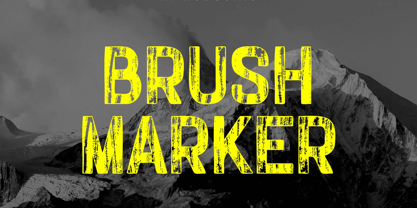 Introducing our new product the name Brush Marker Hand Painted Font. Modern Display font that is beautiful classy, elegant, and modern. This font is perfectly suited for a wide variety of projects, such as signature, stationery, logo, wedding, typography quotes, magazine or book covers, website headers, clothing, branding, packaging design, and more. Also for fashion-related branding or editorial design and displays both masculine and feminine qualities.
 - Okiku by Hanoded,
$15.00 The tale of Okiku Of The Nine Plates is an old Japanese story full of lust, deceit, murder and revenge. It tells of Okiku, a beautiful servant whose master lusts after her. After she refuses his amorous advances, he accuses her of stealing a costly plate and has her thrown down a well, where she dies. She then turns into an Onryō (a vengeful spirit). Okiku font is a thin, all caps, scratched typeface. Upper and lower case differ and can be interchanged. Okiku comes with an afterlife of diacritics.
 - Plener by LetterPalette,
$20.00 Plener is a type family of layered fonts available in four weights: Light, Regular, Bold, and Heavy. The properties of layered fonts are matched with the classical type family structure, which makes Plener specific. The letters have humanist origins, interpreted expressively with short brush strokes separated in layers. These humanist forms keep the text set in Plein Air surprisingly legible. Layer structure allows the user to play with colors and transparency, giving the text a more personal feel. Plener comes in two additional styles, made of layers from the Light and Heavy weight. These new, display styles, named Plener LLH and Plener LHH are separated from the main family. To make the work easier, we created basic fonts out of merged layers (for every weight and style). We recommend users to set the text using these basic fonts first, then apply an opacity value lower than 100%. When satisfied, copy the text on multiple layers, changing the font to Layer A, B, and C. Apply a unique color to the text on each layer or use the same color but different opacity value. Plener fonts have the following features: ligatures, oldstyle figures, proportional and tabular lining figures, fractions, etc. Besides, there are fifteen dingbats set as discretionary ligatures. Contains Latin and Cyrillic. For some extra tips on how to work with the Plener family, see the pdf file attached to the gallery.
 - Eskapade by TypeTogether,
$53.50 The Eskapade font family is the result of Alisa Nowak’s research into Roman and German blackletter forms, mainly Fraktur letters. The idea was to adapt these broken forms into a contemporary family instead of creating a faithful revival of a historical typeface. On one hand, the ten normal Eskapade styles are conceived for continuous text in books and magazines with good legibility in smaller sizes. On the other hand, the six angled Eskapade Fraktur styles capture the reader’s attention in headlines with its mixture of round and straight forms as seen in ‘e’, ‘g’, and ‘o’. Eskapade works exceptionally well for branding, logotypes, and visual identities, for editorials like magazines, fanzines, or posters, and for packaging. Eskapade roman adopts a humanist structure, but is more condensed than other oldstyle serifs. The reason behind this stems from the goal of closely resembling the Fraktur style to create harmony in mixed text settings. Legibility is enhanced by its low contrast between thick and thin strokes and its tall x-height. Eskapade offers an airy and light typographic colour with its smooth design. Eskapade italic is based on the Cancellaresca script and shows some particularities in its condensed and round forms. This structure also provided the base for Eskapade Fraktur italic. Eskapade Fraktur is more contrasted and slightly bolder than the usual darkness of a regular weight. The innovative Eskapade Fraktur italic, equally based on the Cancellaresca script previously mentioned, is secondarily influenced by the Sütterlin forms — an unique script practiced in Germany in the vanishingly short period between 1915 and 1941. The new ornaments are also hybrid Sütterlin forms to fit with the smooth roman styles. Although there are many Fraktur-style typefaces available today, they usually lack italics, and their italics are usually slanted uprights rather than proper italics. This motivated extensive experimentation with the italic Fraktur shapes and resulted in Eskapade Fraktur’s unusual and interesting solutions. In addition to standard capitals, it offers a second set of more decorative capitals with double-stroke lines to intensify creative application and encourage experimental use. The Thin and Black Fraktur styles are meant for display sizes (headlines, posters, branding, and signage). A typeface with this much tension needs to keep a good harmony between strokes and counters, so Eskapade Black has amplified inktraps and a more dynamic structure seen in the contrast between straight and round forms. These qualities make the family bolder and more enticing, especially with the included uppercase alternates. The Fraktur’s black weights are strident, refusing to let the white of the paper win the tug-of-war. It also won’t give away its secrets: Is it modern or historic, edgy or amicable, beguiling ornamentation or brutish presentation? That all depends on how the radically expanded Eskapade family is used, but its 16 fonts certainly aren’t tame.
 - Linden by Journey's End,
$12.00I hope that you enjoy the "Linden" font. The basis for this new font is my Leaf font. As much as I love the Leaf font, however, I felt (and still feel) the desire to have a larger font, for three reasons: 1. I enjoy customizing my internet browser to show different fonts. The original "Leaf" font was a bit too small for that. The new "Linden" font is perfect for this function. 2. Some of the fonts that I use in writing e-mails look their best at sizes 24 or 36. That’s fine for me, but unless I want to go to the trouble each time of changing the size, then the recipients oft my e-mails get wolloped with an enormous-sized font. When I use "Linden" for my e-mails, it’s automatically a perfect size at 12 or 14, solving this problem. 3. I also enjoy customizing the font in which I read my e-mails. Unfortunately, there are only a few which are legible in the tiny size in which this is configured. Again, "Linden" is configured to be large enough automatically so that it can easily be read by anyone. I am pleased to offer a pleasant font for use in any or all of the scenarios; I love fun solutions and hope that you will enjoy the "Linden" font. (Just a tip: when printing out documents using the "Linden" font, I love it best in font size 11!) - Bemicy by Product Type,
$17.00 Say hello to Bemicy, a display font that combines handwritten touches with scribbled elements. This font comes with uniqueness and wit, bringing an experimental feel to each character. Each letter in Bemicy exudes a touch of scribbled handwriting, creating a stunningly experimental feel. Bemicy brings artistic uniqueness to your projects, giving them a look that is full of character and distinction. Bemicy is a great choice for projects that require an experimental, scribbled hand feel. Whether you're designing promotional materials, posters, or other works of art, these fonts provide an unforgettable personal touch. Get the Bemicy Display Font now and bring artistic distinction to every character.
 - Brillig by Scholtz Fonts,
$19.00 Brillig is a loose and informal handwriting font. It comes in four flavors, each of which has a very different feel. Brillig Gimble: more formal in that the characters are interconnected as in cursive script. To further enhance this effect, the characters have been created with a slightly "blobby" pen which provides a suggestion of precision. Brillig Earth: is bold and strong. It is more "down-to-earth" than the other styles, however, the boldness is tempered with quite wispy ends (terminuses) to the characters. It conveys a suggestion of speed and strength. Brillig Aire: is the most delicate and ethereal of the styles. Think of fairies, dandelions and dragonflies and you have an idea of what Brillig Aire conveys. Not only are the characters very light in weight, but they terminate in a wispy, delicate end. In spite of all this, Brillig Aire is very readable and can be used in a variety of contexts. Brillig Brave: is quite like Gimble in its feel with one important difference -- the characters are not connected as in cursive script. Each character stands alone. Brillig Line: is a clean, lightweight style using a mono width line for an informal, handwritten feel. There is a collection of the above four styles that is attractively priced and gives you the ability to use these four fonts in a variety of ways within the same document. The font is particularly useable for the promotion of products aimed at designers of: wedding invitations, party invitations, young clothing ranges, magazines, cosmetic packaging. It has been carefully letterspaced and kerned. All upper and lower case characters, punctuation, numerals and accented characters are present.
 - ZT Vollun by Khaiuns,
$29.00 ZT Vollun is a work of awakening from my valley of boredom in making fonts, it is not only a transformation of thickness, but also in terms of theme, aura, shape and beauty. Maybe this is a superstition of adulthood and also as we get older, our taste in cigarettes can change too. And the taste of the coffee is also getting bitter, in fact there is no sugar anymore, but the enjoyment is increasing. ZT Vollun consists of seven weights, starting from the thin one with curves combined with thin strokes, offering a playful aura, to the thickest one with a firm design that will present a thick modern atmosphere. Whether you're working on a branding project, an editorial project, or any other graphic project, ZT Vollun is the perfect choice for a modern, elegant look or any design vibe you can get your hands on. I hope you have fun using ZT Vollun. Thanks for using this font
 - VVDS Ginsburg by Vintage Voyage Design Supply,
$10.00 Ginsburg it's a modern display all-caps font-family based on geometric forms and abstract wavy lines with an old school constructivism look. Inspired by Moses Ginsburg architecture projects. Playful, modern, suitable for many typography projects as headers, logos, block texts, etc. You may be more strict in your typography or you may be more groovy or playful with alternates characters. Use this family in vintage spirit for TV series, Podcasts titles, exhibition posters or design a modern extreme sport brochure, . Flexible, Catchy and Brazen — it's all about Ginsburg! Six widths: Thin / Light / Normal / Medium / Semi Bold / Bold. Opentype Features as Stylistic alternates, Oldstyle figures / Fractions. Multilingual
 - Shizzle by 38-lineart,
$15.00 Shizzle is a font with a graffiti marker style. The lettterform of ‘Shizzle’ essentially made by the combination of downward and upward stroke base on -15 degres angle guideline. The basic of downward stroke is pulling pen from the top left to thw bottom right with full width of marker, then the basic shape of upward stroke look like the ligh flick by using the tip of the pen from bottom right to the top left. Inspired by Hip Hop and Rap style style. ‘Shizzle’ is a slang way of saying "Sure". People generally use it to communicate agreement to another person. This term is a product of Snoop Dogg's penchant for replacing the end of words with "izzle" to sound cooler. And ‘Fo Shizzle’ (for sure) this font offers beautiful typographic harmony for a diversity of design projects, including logos & branding, social media posts and advertisements, especially with graffiti look.
 - Lorjuk by Aisyah,
$12.00 Lorjuk is a handwritten font that features a natural and casual style. It has a personal and unique touch, with strokes that mimic the look of hand-written letters. This font is perfect for adding a personal touch to your designs, such as invitations, posters, or social media posts. The font is versatile and can be used for various projects, from informal to more formal ones.
 - ATHEWE by Twinletter,
$17.00 Athewe is a display font with a strong and courageous superhero theme. Created specifically for projects that require a bold, impressive impression, this font is the perfect solution for creating bold and bold designs. With Athewe, you can bring an awesome superhero feel to any of your projects. This font brings strength and boldness to your designs, creating a look that is both impressive and full of character. Each letter expresses a strong and daring style, delivering a memorable message to your audience. With features such as ligature and alternate, Athewe provides unlimited flexibility and creativity. You can combine these font elements to create unique and interesting variations of the style. In addition, multilingual support allows you to use Athewe in multiple languages, so your project can reach a global audience. If you’re looking for an alluring, powerful, and superhero-themed font, Athewe is the right choice. With a striking style and features that allow for creative experimentation, this font will catch the eye and inspire your potential customers. What’s Included : - File font - All glyphs Iso Latin 1 - Alternate, Ligature - Simple installations - We highly recommend using a program that supports OpenType features and Glyphs panels like many Adobe apps and Corel Draw so that you can see and access all Glyph variations. - PUA Encoded Characters – Fully accessible without additional design software. - Fonts include Multilingual support
 - Mirabel by Canada Type,
$24.95 Mirabel is based on the handwriting of Beverly Bouwsma (Philip's mother), which she developed in the 1930s in, as she puts it, an act of teenage rebellion. In the 1960s, Philip gave her a broad-edged Osmiroid fountain pen which she took to immediately and has used ever since, along with the computer fonts he made from her script. Since Beverly Bouwsma mixed loops and straight ascenders, two interchangeable fonts have emerged, a formal package that sacrifices some flamboyance for classical balance and legibility, but retains the quality of the writing and celebrates the personality of its creator. The Mirabel fonts are available in all popular font formats, and the character sets cover a wide range of codepages, including Central and Eastern European languages, Esperanto, Turkish, Baltic, Celtic/Welsh.
 - Museum Tertia Cursive by T4 Foundry,
$21.00Museum Tertia Cursive is inspired by a beautiful set of 126 matrices in the Swedish Norstedts type collection. These types were probably manufactured in Germany before 1750. The matrices are part of a set imported to Sweden by J.P. Lindh from Breitkopf & Härtel 1818. Now this exquisite design is available again, thanks to type designer Torbjörn Olsson. Please note modern additions like the ?-mark, @-sign and €-sign. Museum Tertia Cursive is an OpenType creation, for both PC and Mac. Swedish type foundry T4 premiere new fonts every month. Museum Tertia Cursive is our eighth introduction. Museum Tertia Cursive is part of the growing Museum type family. Museum also includes three different border fonts, an ornament font with some of Granjon's arabesques and a flowery Fournier font with Rococo capitals. - Villager by Sign Studio,
$12.00 Villager font created with a simulated ballpoint will give it a natural handwritten shape. It's perfect for a signature, diary, business card, greeting card or printed product with a casual theme. With the discretionary ligature and alternate characters, it will make you a good choice of writing variations.
 - Aguadija by Christian Gamba Pardo,
$12.90 This font contains plant icons from the taxonomic category Orchidaceae, inspired by the multiple specimens that can be found in Colombia that has the largest number of orchids in the world, more specifically in the specimens that have been exposed on the José Celestino Mutis botanical garden. These icons are characterized by having an organic outline; representing flowers, roots, leaves, bulbs and different supports or pots. The vast majority of icons have perfect bilateral symmetry because this is one of the differential characteristics of orchids (compared to other flowers), if they are divided by a central-vertical axis, their right and left sides are practically identical. “Aguadija” can be used in projects related to nature or similar topics, some icons (specifically the digits) are intended to form decorative ribbons or borders.
 - Kugelhopf JF by Jukebox Collection,
$32.99 Kugelhopf is a calligraphic style font with an old-world Blackletter feel to it. Full of charm and flair, this friendly script font will lend a sense of childlike magic to any design. Perfect for themes relating to holidays, fairy tales, storybooks and even Renaissance designs, Kugelhopf was inspired by a hand-lettered sample in an old book about sign painting. It can also be used for cards, invitations and scrapbooking as well! ‘Kugelhopf’ is a German & Austrian holiday yeast cake from which our modern western Bundt cake was derived. It has a particular shape that is said to be inspired by Turkish turbans. Jukebox fonts are available in OpenType format and downloadable packages contain both .otf and .ttf versions of the font. They are compatible on both Mac and Windows. All fonts contain basic OpenType features as well as support for Latin-based and most Eastern European languages.
 - Cleveden by Greater Albion Typefounders,
$9.50 Cleveden was inspired by some lettering sighted on a neglected and somewhat tarnished brass plaque, affixed to an elderly office building. The elegance and character (somehow playful and formal at the same time) of the letterforms shone through the tarnished state of the plaque. As an aside the brass plaque in question was on the former business premises of a long established firm of accountants. We suspect the ethics of that profession would preclude us identifying which one. Our efforts to identify their engraver have proven unavailing. Cleveden is a family of four typefaces, Regular, Bold, Capitals and Capitals Bold. They are ideal for designs that call for distinctive formality and especially lend themselves to signage, certificates, and -dare it be said- engraved plaques!
 - Varisse by AVP,
$19.00 Varisse spans over two centuries of type design and draws its inspiration from well-loved classics that are as fresh today as they were when they were created. The range stretches from a quintessential 18th century transitional serif to an uncompromising 20th century sans. Think Baskerville, think Gill. The idea was to create a family that shared similar forms and the same vertical metrics, allowing them to be mixed to provide impact and readability as required. With a generous x-height and a host of options, the Varisse family is ideally suited to branding, packaging, magazines and editorial. It also provides a wealth of opportunity in website presentation. The fonts are divided into five subfamilies by degree of ‘serification’. Varisse Sans Varisse Soft Sans Varisse (normal) Varisse Soft Serif Varisse Serif Each subfamily contains six weights and accompanying italics.
 - Andron 2 by SIAS,
$44.90 The sister fonts Andron 2 English and Andron 2 Deutsch provide a groundbreaking new possibility to render literature text bodies in a sophisticated traditional and yet modern way of type. In German typographic history there has once been a long-lasting struggle called the Frakturstreit (the blackletter quarrel). It was about wether German text ought to be composed in blackletter or rather in Roman type, a question upon which even Goethe, Schiller and other period celebrities got grey over time. However, blackletter type remained alive and has just recently seen an astonishing renaissance. This is not about a blackletter revisionism or some ‘mixture’ concept arguably bridging the gap between either worlds. Andron 2 English and Andron 2 Deutsch offer a new approach to circumvent that old antagonism. As for the lowercase letters I applied certain features of blackletter type onto the glyphs – but entirely abandoned the principle of the broken stroke as such. The result is a lowercase alphabet in the classical Andron style which may be considered an attractive alternative for text in English, German or even other languages. So it’s no longer entirely about choosing between ‘modern’ Roman or ‘ancient’ blackletter only. Andron 2 English Regular and Andron 2 Deutsch Regular feature the same lowercase glyphs but differ in the majuscules (Andron 2 English has normal Latin capitals). ++++ 2012 + NEW! +++ In response to its growing popularity we now present five new fonts as part of the Andron 2 series. Andron 2 English is completed by an Italic and a Bold font. Andron 2 Deutsch now contains three interesting alternative fonts: Italic, Scriptive and Laendlich. Last but not least – A new set of wonderful classical typographic ornaments is part of the Italic and Scriptive fonts. – You can also purchase these ornaments separately as “Andron Ornamente”.
 - Balian by Alit Design,
$24.00 The BALIAN font is inspired by Balinese style carvings, because it is made in Bali and the Balinese also make it. The unique and beautiful engraving forms create a display font with character. The Balian font is perfect for classic and unique themed designs, besides that this font is perfect for t-shirt designs, poster titles, text headers or logotype designs.
 - Monocolo by Kprojects,
$25.00 Monocolo is the result of a reflection on communication and of the language evolution in the new media. For this reason, some emoticons have been added to the usual glyphs and symbols and icons have been added to the regular. These glyphs, through the use of Discretionary Ligatures (DL) feature, can be recalled by using their name or idea associated with them (in the English language). This feature is designed to retrieve the icons quickly and not to be applied to a text, therefore you have to pay attention to compound words when used through DL.
 - P22 Bangersfield by IHOF,
$29.95 Bangersfield is a four-member font family from Robby Woodard. With line treatments clearly inspired by cased meat products, these fonts function as a healtier alternative to Comic Sans. The casual hand lettering works well for light-hearted design and comic lettering. These fonts are stuffed with opentype features, extra ornaments, and a full Central European character set—over 400 characters per serving. Satisfy your hunger for a fresh take on a stale genre!
 - Rockland by Monotype,
$15.99 This is an original, confident and cheeky little font; characterised by its boldness and dense letterforms, which boast a solid texture and distinctive lack of counters. Drawn with a marker pen, the bounciness of Rockland counteracts its solidity to make for a friendly aesthetic that’s as confident as it is playful.